

A UI/UX design process that skips straight to high-fidelity screens usually produces late-stage rework, because assumptions about user flow and content only surface once real users or developers interact with the work. Moving deliberately through research, wireframes, prototypes and a structured developer handoff catches these problems while they are still cheap to fix.

Key takeaways
- Research and user flows should exist before any visual design decision is made.
- Wireframes, high-fidelity design and prototypes solve different problems and should not be skipped or merged to save time.
- A developer handoff needs states, specs and assets defined — not just finished-looking screens.
- Skipping stages under deadline pressure is the most common cause of expensive late-stage rework.
Who this is for: Founders, product owners and marketing leads briefing or reviewing a UI/UX design engagement for a website or product.
Where the process actually starts
Visual design is not the first step. Before any screen is drawn, the team needs to understand who the user is, what task they are trying to complete, and what has to be true about the content and data for that task to work — otherwise the design solves the wrong problem well.
- Who is the primary user, and what do they already know coming in?
- What is the one task this flow must let them complete?
- What content, data or system state does the screen actually depend on?
- What does success look like for the user and for the business?
The core stages, in order
Each stage produces a specific output and should be reviewed before the next one begins.
| Stage | Output | What it validates |
|---|---|---|
| Research & flows | User flows, sitemap | The right screens exist in the right order |
| Wireframes | Low-fidelity layout | Hierarchy and content structure, without visual distraction |
| Visual design | High-fidelity screens | Brand, hierarchy and readability applied to the validated layout |
| Prototype | Clickable flow | The experience actually works end to end, not just per screen |
| Developer handoff | Specs, states, assets | Engineering can build it without guessing intent |
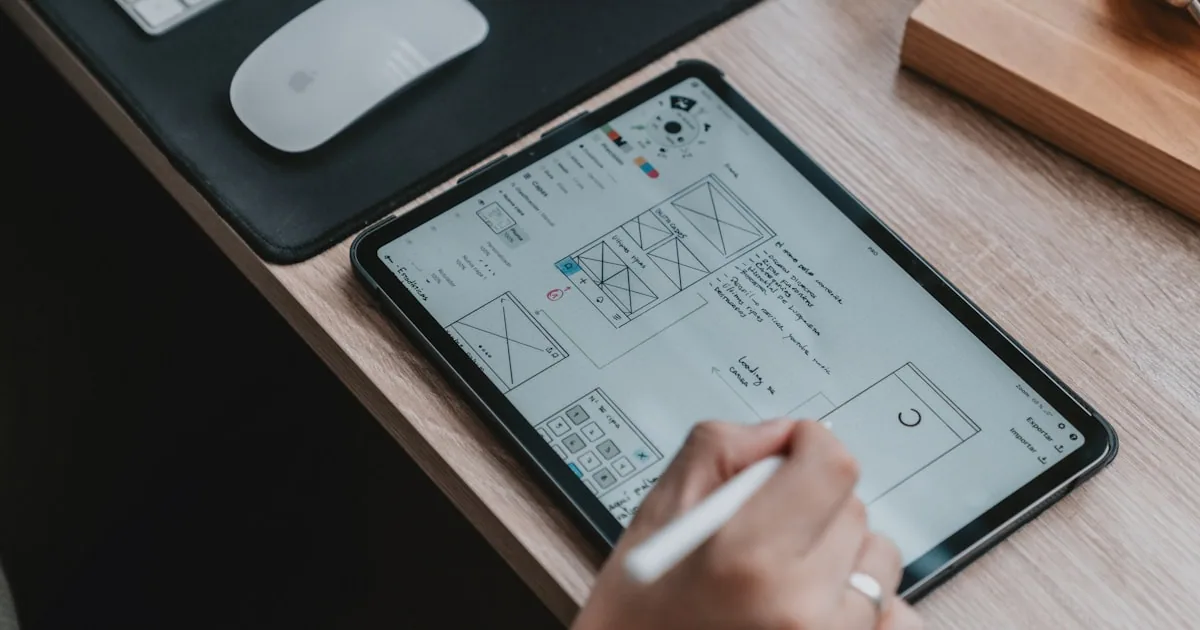
Wireframes, high-fidelity design and prototypes are not interchangeable
Each format exists to answer a different question, and collapsing them to save time usually moves the wrong kind of feedback to the wrong stage.
- Wireframes answer: is the content in the right place, in the right order, for this user?
- High-fidelity screens answer: does this look and read the way the brand and hierarchy require?
- Prototypes answer: does the flow actually work end to end, including transitions and edge cases?
- Feedback on brand color during a wireframe review, or feedback on content structure during a visual review, is a sign the stages are being mixed
Developer handoff, done properly
A handoff is not a folder of finished-looking screens. Development needs the states and rules behind those screens made explicit.
- 1Define every meaningful state: default, loading, empty, error and success.
- 2Specify spacing, type and color as reusable tokens, not one-off values per screen.
- 3Document responsive behavior at each breakpoint, not just desktop and mobile endpoints.
- 4Export or link every asset developers need at the resolution they need it.
- 5Walk through the prototype together and resolve open questions before build starts.

Where late-stage rework actually comes from
Skipping wireframes to reach a polished-looking design faster is the most common cause of expensive rework, because stakeholders approve based on visual polish while the underlying content structure and flow logic remain unvalidated. Problems then surface during development, when they are far more expensive to fix.
A short checklist before development starts
Confirm each of these before treating a design as handoff-ready.
- User flows and content structure were validated before visual design began
- Every screen state a developer will need to build has been designed, not just the default
- Responsive behavior is specified, not left to developer judgment
- The full flow was tested as a clickable prototype, not reviewed screen by screen
- Open questions from the handoff walkthrough have documented answers
How to use this guide with your team
Design reviews are more productive when stakeholders evaluate a specific customer task instead of expressing general visual preferences. Ask whether the hierarchy, evidence and action help the intended visitor move forward.
Use realistic content and difficult states during review. Long service names, validation errors, missing images and small screens reveal whether the system is genuinely flexible.
Record approved patterns and their purpose so later pages remain consistent without forcing every page into an identical composition.
Practical next steps
Use the following actions as a short working session. Record decisions, owners and unresolved questions so the article becomes an implementation aid rather than passive reading.
- 1Review designs through customer tasks.
- 2Use representative real content.
- 3Check mobile, error and empty states.
- 4Document component purpose and behavior.
- 5Validate the implemented page against the design intent.
Frequently asked questions
Can wireframes be skipped for a small project?
For a very small, familiar layout it can be tempting, but skipping wireframes on anything with more than a couple of screens usually shifts structural feedback into the visual-design or development stage, where it costs more to change.
Who should review a prototype before development starts?
Include someone who did not work on the design — a founder, a support or sales team member, or another developer. Fresh eyes catch flow problems that are easy to miss after staring at the same screens for weeks.
Sources and further reading
Last reviewed: September 4, 2026